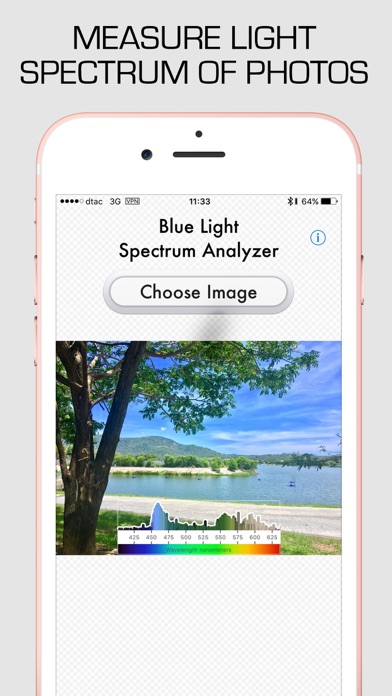
Blue Light Spectrum Analyzer
Having trouble with motivation or sleep? You are not alone! Use the blue light spectrum analyzer to check your environment and find sources of blue light - a powerful motivator and wakefulness agent.
Want to wind down and sleep? Eliminate sources of blue light and use filters to signal your body it is bedtime.
HOW TO USE
Take photos of your bedroom, bathroom and your work station.
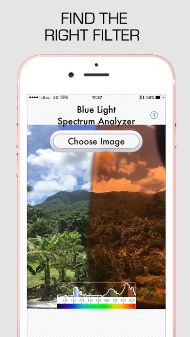
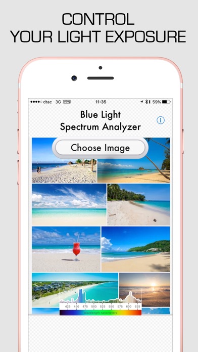
Analyze the photos with the Blue Light Spectrum Analyzer app
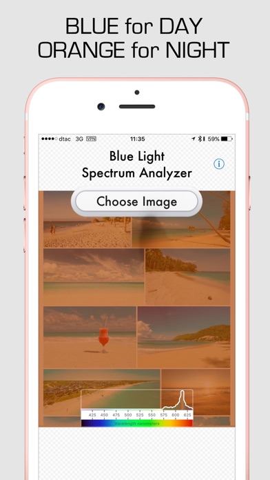
Orange and gray are sleep inducing
Blue and bright saturated colors are wakefulness promoting
CONTROL YOUR EXPOSURE
Taking simple steps, like changing the light bulbs in your bedroom and bathroom to use softer color temperature (less than 3000K) can mean a lot for how quickly you fall asleep. Installing dimmers or using backup light sources at night is another thing you can try to make it easier to fall asleep. Reducing night time screen use or wearing light-filtering glasses can help with falling asleep faster.
NANOMETERS MATTER!
Your eyes contain super-sensitive photo pigment called Melanopsin. When activated by blue light in the 420-480 nanometer spectrum range, it sends a powerful signal directly into the sleep-wake control center of your brain. When Blue Light is detected, your brain suppresses production of Melatonin, an important hormone that promotes sleep and wellbeing.
Naturally there are no sources of blue light at night. Our eyes are adjusted to stars, moon and wood fire. We can tolerate some amounts of orange light at night, but not light from daylight-spectrum lightbulbs. These shock our system and disrupt sleep.
MEANINGFUL IMAGERY
We are attracted to meaningful light sources. A flat panel of blue is unnatural and does not activate our brain in the same way as looking out the window at the sky. Use the spectrum analyzer app to see how much light comes through your windows, photo-frames or other light sources.
RELATIVE MEASUREMENT
I’ve put a lot of work into making sure the app provides measurements which are useful for an average person. Take a look at the photo and be able to visually confirm colors present to match the spectrum analysis. As such, the color space used by the app is not photographically correct. First, there are no true black or white, the spectrum is cut off at 630nanometers (everything from 630-700 appears as red). I’m coloring the bars with an average brightness of light at that wavelength. As such, very subtle saturations of different wavelengths appear as gray.
